Switch To The No Glass Dock In Leopard, The Best Dock Ever
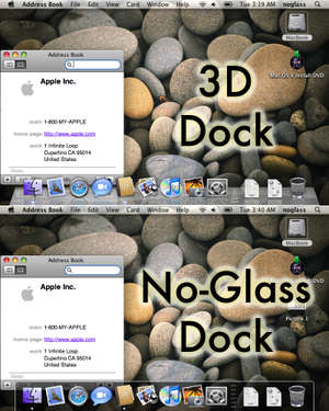
 The default dock in Leopard is the "3D Dock". At first it looks pretty cool. It's very shiny, it has a reflective gloss to it that reflects any windows you hold near it. But it doesn't take long for this dock to really get on your nerves. Here are my main beefs with it:
- It's Slow! If you're using Leopard on a G4 for example, it takes a lot of computer power to generate this glossy, reflective dock. Switching over to the no-glass dock will speed up your whole system! Especially if you're running it on slower, unsupported systems.
- It's hard to see! Apple has changed the indicator that tells you when an application is running. It used to be a small black triangle, now it's a small glowing light. This would be fine except the dock is a reflective glossy 3D looking object now, and these lights blend right in, making it very hard to see what apps are running and not.
- It's awkward! No matter what your dock looks like, your screen is only 2D. The 3D look is just leaves you with icons that are, in the real 2D nature of your screen, half on the dock, half hanging off the top of the dock. And between all the gloss, and reflections, and transparency, its just a big, ugly mess.
The No-Glass dock on the other hand, is the best Dock apple has ever created. It doesn't try to be something it's not. It does 2D and it does it well. There is transparency but there is no gloss, and no reflection. Just a dark and well defined area with a clear border. Inside this area that is the 2D dock, your icons have increased contrast and increased visibility.
How To Do It:
Paste these lines into the Terminal and hit return:
To switch to the NoGlass Dock:
defaults write com.apple.dock no-glass -boolean YES; killall Dock
To switch back to the default, ugly, 3D Dock:
defaults write com.apple.dock no-glass -boolean NO; killall Dock

 MacFixer Feed